Accessory Colors for a Capsule Wardrobe
A capsule wardrobe is often described through clothes: faithful jeans, a favorite knit, the jacket that makes a rushed exit feel composed. Accessories are where that edit becomes personal. A charm on a tote, an earring in a surprising shade, or a scarf that brightens a neutral sweater can shift the mood without asking you to rebuild the outfit. The useful question is not which colors are universally essential. It is which colors make your existing clothes feel more like you on an ordinary Tuesday.
Think of color as a set of roles, not a rulebook. One group keeps pieces easy to combine; another adds depth; a third is allowed to be playful and occasional. Thoughtful capsule wardrobe accessories can be noticed without turning every morning into a matching puzzle.
Begin with the colors already doing the work
Pull out the tops, jackets, shoes, and bags you have worn most over the last two weeks. Rather than counting every hue, look for repeat players. Maybe your wardrobe leans black, cream, denim blue, and soft grey. Maybe it is chocolate, ivory, olive, and faded red.
Choose one accessory color that sits comfortably beside most of them. For black and denim, it might be silver, cherry red, or a clear glossy detail. For cream and olive, deep brown or tomato red may feel natural.
Try a quick rail test: hold a candidate accessory by three garments you wear in different settings. A cobalt keychain may look great with a weekend denim shirt, quieter beside a navy blazer, and excellent again near a white tee. That does not rule it out; it tells you cobalt is an accent rather than your everyday bag color.
Give the palette a base, a bridge, and a spark
Start with a base: a calm shade repeated across practical pieces, such as black, tan, navy, brown, or pearl-like white. This is the color for the bag you carry most, a simple belt, or those details that need to work for both office mornings and coffee runs.
Next, add a bridge color. It picks up a tone already present in your clothes without duplicating the base. If your base is black and the wardrobe includes denim and rust knits, try silver or deep burgundy. If the base is warm brown, muted pink or olive can connect a striped shirt, camel jacket, and white trainers. The bridge adds a little depth while staying easy to repeat.
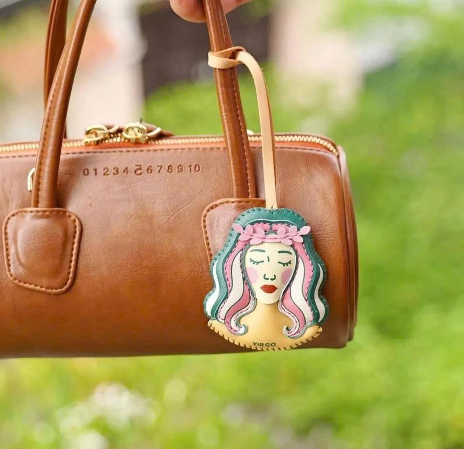
Finally, reserve one spark: the shade that makes you smile when you see it on a chair or handbag. Lemon yellow, lilac, bright green, glossy red, or an animal character can live here. Sparks are especially useful in small doses—a charm, hair clip, phone strap, or pendant. Their job is not to coordinate with every hanger; their job is to interrupt predictability at the right moment.
Use accessory size to control the color volume
Color does not arrive at the same volume on every item. A red shoulder bag announces itself across the room; a red zip pull or charm reads more like a wink. Keep high-energy colors on smaller accessories when you want freedom, and place quieter shades on larger items when you want the most outfit mileage.
Picture three ordinary departures. For a presentation, start with a navy suit and dark bag, then add a small burgundy detail near the handle. For a museum afternoon, repeat one blue note with jeans and a bright blue charm on a roomy tote. For dinner after work, leave a black dress uncomplicated and let an emerald earring or playful keychain do the conversational work. The clothes can stay stable while the accent changes the tone.
The Chihuahua bag charm can be the spark in a mostly neutral rotation: clip it to a black work tote one day, a faded denim bag the next, or a weekend backpack when you want a little character at the door. It does not need to match a print or shoe exactly to feel intentional.
Plan repeats, not perfect matching
Matching every accessory to the same shade can make a small wardrobe feel narrow. Repetition is more useful. Let a color show up in different forms across the week: a rust scarf on Monday, a rust-toned charm on Friday, and a warm pouch on Sunday. The recurrence makes the selection feel connected, while the differences prevent it from looking like a set.
For an easy weekly formula, choose a base bag color, two bridges, and one spark. With black as the base, you might select silver and burgundy as bridges, plus cheerful yellow as a spark. With tan as the base, green and soft blue can bridge, with bright red saved for an outfit that wants a little theatre. Put the four colors in a phone note before you browse; it is a useful pause before a beautiful-but-isolated shade joins the collection.
When your wardrobe has patterns, let the pattern suggest the bridge. A navy-and-cream striped cardigan welcomes navy, red, pale blue, or metallic details more readily than an unrelated neon. A floral dress does not need an exact petal match; choose a background or leaf color instead. You are making an echo, not completing a paint-by-number exercise.
Refresh the edit when your routine changes
Capsules can move with your calendar. A month of commuting, a run of celebrations, or a holiday season full of dinners may change which color you reach for first. Rather than replacing the palette, rotate the spark. Put the vivid charm, bold clip, or bright pouch where you can see it, and store the previous accent with the pieces it suits best.
For a light reset, browse all accessories by the role they could play, then visit new arrivals with one empty role in mind. Ask, “Is this a base, bridge, or spark?” If the answer is unclear, it may still be charming, but it may not join your everyday rotation.
Ideas can come from unexpected places: a readerly detail in bag accessories for book lovers, a small gesture explored in small surprises for hosts, or personality-first styling in animal keychains as personal signatures. The best capsule palette leaves a little space for delight. Build a dependable foundation, then let one accessory make the outfit feel newly yours.